Scan Date:Apr 25, 2026
Show More
M3 Catalog 🚀
This app is for developer demo purposes.
📚 Source Code: GitHub - Material Design Components
https://github.com/boltuix-store/Material-Design-Components
📖 Documentation: Material 3 Guidelines 2025
https://www.boltuix.com/2025/06/material-3-guidelines-2025.html
Material is an adaptable system of guidelines, components, and tools that support the best practices of user interface design. Backed by open-source code, Material streamlines collaboration between designers and developers, helping teams quickly build beautiful products. 🌟
Components 🛠️
Material Components are interactive building blocks for creating a user interface.
Here's the comprehensive list with added components:
* Adaptive 🖥️: Flexible layouts for various screen sizes
* App Bars: Bottom 📱: Navigation and action bars at the screen bottom
* App Bars: Top 📍: Navigation bars at the top of the screen
* Backdrop 🎨: Layered content with a front and back view
* Badges 🔔: Badges for notifications or status on UI elements (BadgeDrawable)
* Banners 📢: Temporary messages for user attention
* Bottom Navigation 🧭: Switch between UI views at the bottom
* Bottom Sheets ⬇️: Secondary content anchored to the bottom of the screen
* Buttons 👆: Core components for triggering actions in a UI
* Buttons: Floating Action Button (FAB) ➕: Floating action buttons for primary actions
* FAB Menus 🔄: Menus expanding from FABs for related actions
* Cards 🗂️: Display content and actions for a single subject
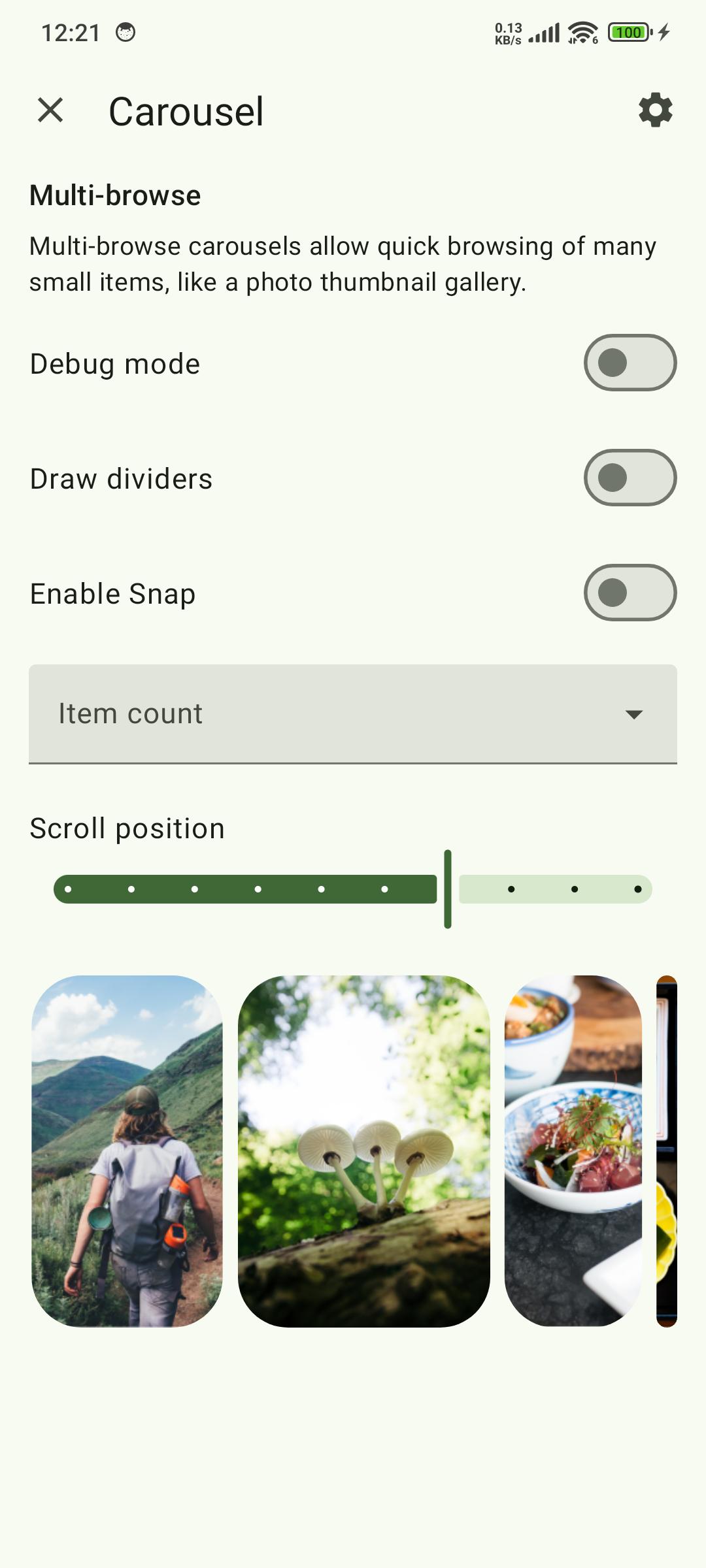
* Carousel 🎠: Scrollable collection of items on and off screen
* Checkboxes ✅: Select one or more items or toggle on/off
* Chips 🏷️: Enter info, make selections, filter, or trigger actions
* Data Tables 📊: Organize and display structured data
* Date Pickers 📅: Select a date or range of dates
* Dialogs ❗: Important prompts in a user flow
* Dividers ➖: Thin lines to group content in containers
* Docked Toolbar ⚓: Fixed toolbars for frequent actions
* Floating Toolbar 🛠️: Dynamic toolbars for contextual actions
* Icon and Segmented Buttons 🖼️: Buttons with icons or segmented options for interaction
* Image Lists 🖼️: Grid or list of images
* Lists 📋: Vertical lists for content display
* Loading Indicators 🔄: Visual cues for short loading processes
* MaterialTextView ✍️: Enhanced text display component for Material 3
* Menus 📜: Display a list of choices on a temporary surface
* Navigation Drawer 📂: Switch between UI views on larger devices
* Navigation Rail 🚆: Switch between UI views on mid-sized devices
* Progress Indicators ⏳: Show unspecified wait times or process duration
* Radio Buttons 🔘: Select one option from a set
* Search Bar 🔍: Enter keywords or phrases for relevant information
* Selection Controls 🎚️: Manage user selections (checkboxes, radio buttons, switches)
* Sheets: Bottom 📄: Secondary content at the screen bottom
* Sheets: Side 📑: Secondary content anchored to the side of the screen
* Side Sheets 📘: Secondary content anchored to the side
* Sliders 🎚️: Make selections from a range of values
* Snackbars 🔔: Brief updates about app processes at screen bottom
* Switches 🔄: Toggle the selection of an item on or off
* Tabs 📑: Organize content across different screens and views
* Text Fields ✍️: Allow users to enter and edit text in a UI
* Time Pickers ⏰: Help users select and set a specific time
* Tooltips 💡: Brief descriptions for UI elements
🚀 Now Available on CodeCanyon
Purchase the Kotlin version of Material UIX - your ultimate toolkit for crafting sleek, modern, and responsive user interfaces.
Modern App Template – A Responsive and Customizable UI Kit for:
* Jetpack Compose
* Android Kotlin
* Flutter
👉 Get it on CodeCanyon
https://codecanyon.net/user/boltuix
Latest Version
1.2025.5Uploaded by
Pham Vinh
Requires Android
Android 5.0+
Category
Free Libraries & Demo AppContent Rating
Everyone
Security Report
Report
Flag as inappropriateLast updated on Oct 31, 2025
🆕 Material Design 3 UI Updates
🐛 Firebase Bugs Fixed
🛠️ New M3 Components Added
📜 Open Source Compliance
📝 Guideline Documentation Added


APKPure - A multi-platform app store primarily focused on Android, providing extensive app-related content. Discover the app you want easier, faster, and safer, with quick and efficient downloads and installations.


