Use APKPure App
Get Syncfusion Xamarin UI Controls old version APK for Android
The app helps developers explore the components in Essential Studio for Xamarin.
Essential Studio for Xamarin is a comprehensive collection of components for the Xamarin.Android and Xamarin.Forms application development platforms. It includes a rich selection of components including charts, grids, list view, gauges, maps, scheduler, pdf viewer and much more.
This app helps developers explore the capabilities of all the components included in the package.
Key Highlights
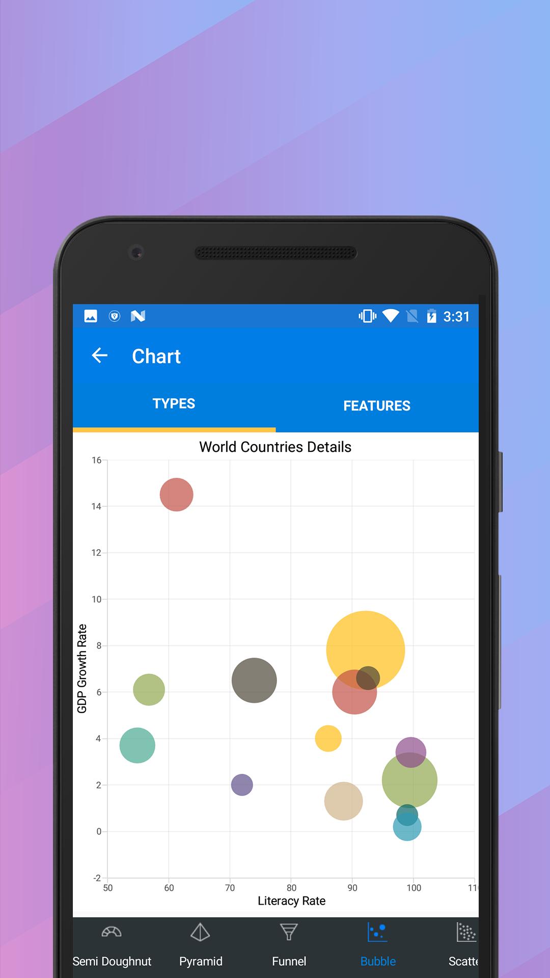
Chart: Plot over 25 chart types ranging from line charts to specialized financial charts.
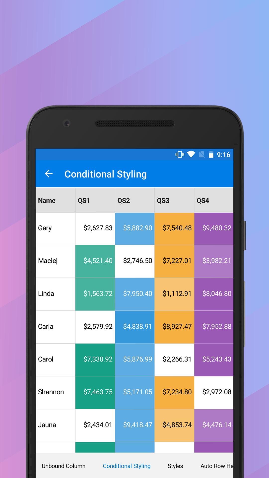
DataGrid: Full-featured grid control with advanced features like grouping, sorting, filtering and export to excel.
ListView: Advanced ListView component with features like grid layout, grouping, pull-to-refresh and filtering.
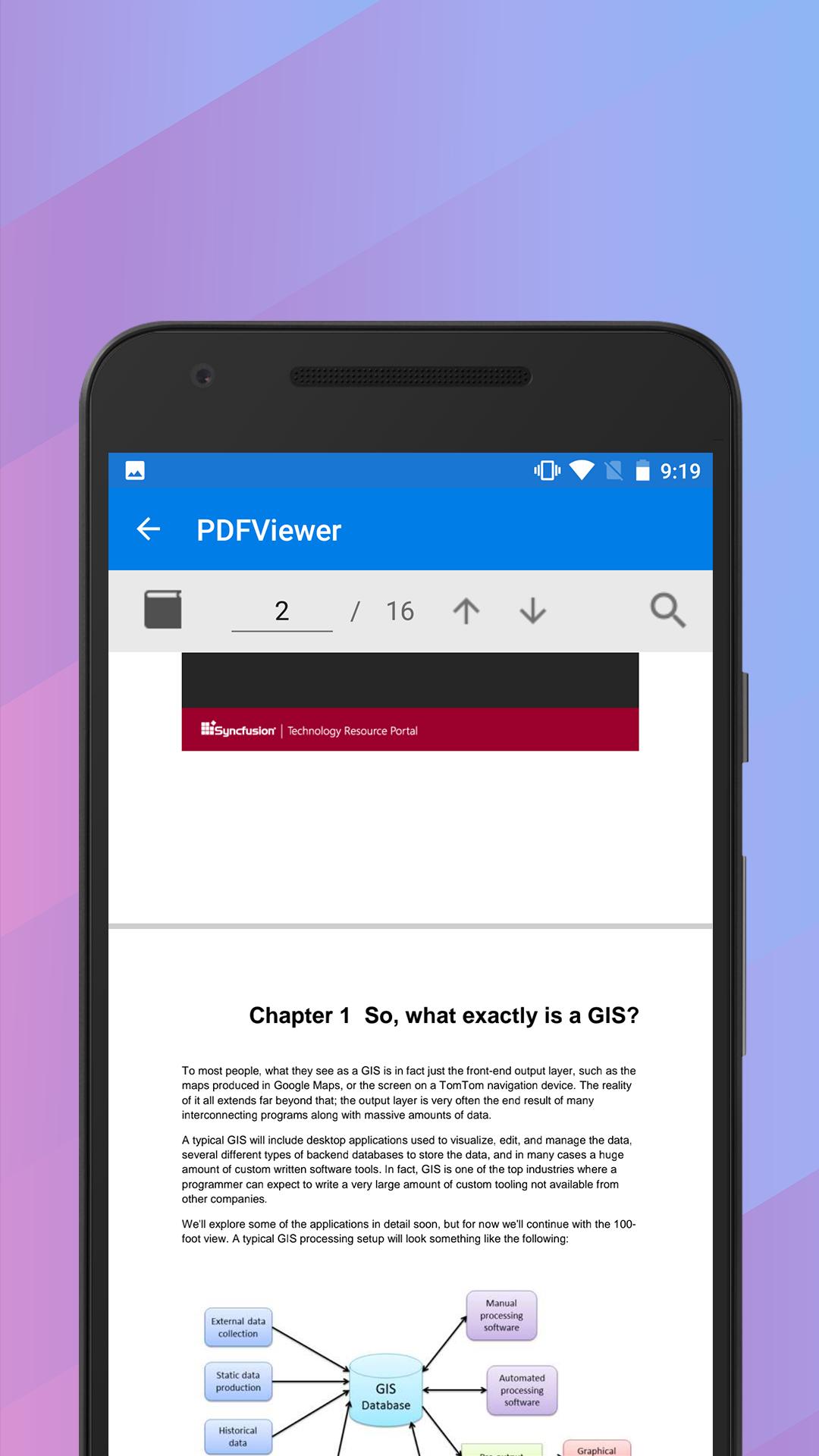
PDFViewer: High performance PDF Viewer component with features like search, zooming and text selection.
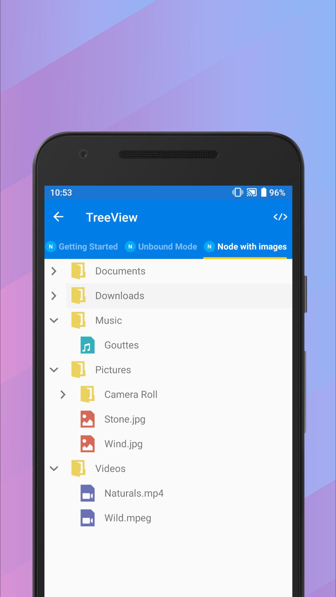
TreeView: is a data-oriented control that displays data in a hierarchical structure with expanding and collapsing nodes.
TextInputLayout: The text input layout control adds decorative elements like floating label, icons, assistive labels on top of input views such as masked textbox, numeric textbox, entry and editor.
Autocomplete: Provide useful suggestions to users based on the already typed content.
NumericTextBox: An advanced version of the text box control that restricts input to numeric values.
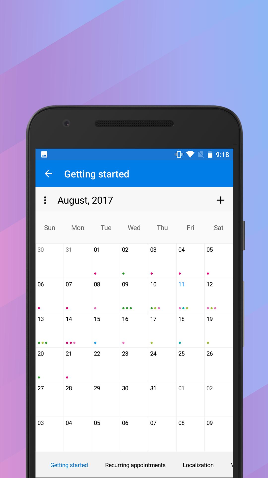
Calendar: Month-View calendar interface for displaying events and selecting dates.
NavigationDrawer: The navigation drawer control is a sliding panel that can be used to hide content like menus from the visible area of the screen.
Gauges: Visualize numeric data using Circular, linear and Digital gauge controls.
Range Navigator : The Range Navigator control provides an intuitive interface for selecting a smaller range from a large collection.
Scheduler : Powerful calendar interface with appointment management capabilities.
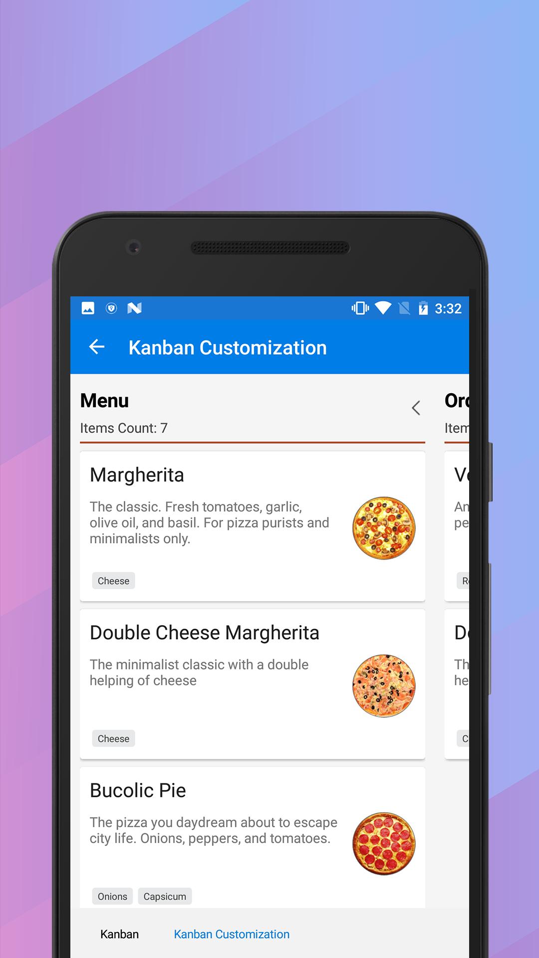
Kanban: The Kanban control provides an efficient interface to track and visualize the different stages in a task or workflow.
Picker: Highly customizable picker control with features like cascading selection.
PullToRefresh: Panel control with built-in support for triggering refresh when the user performs a pull-down action.
SunburstChart: Visualize hierarchical data using concentric circle layout.
Maps: Easily visualize business data over a geographical map.
Treemap: The tree map control provides a simple yet effective way to visualize flat or hierarchical data as clustered rectangles.
Barcode: Easily generate one and two-dimensional barcodes including QR codes within your applications.
Sparkline: Sparkline's are small charts typically drawn to depict trends in data.
RangeSlider: The Range slider control allows the user to select the range of values within the specified minimum and maximum limits.
BusyIndicator: Pre-built animations to indicate busy status within your applications.
DataSource: Simplifies connecting with various data sources and performing operations like sorting, filtering and grouping.
Backdrop: Backdrop appears behind all other surfaces in an app, displaying contextual and actionable content using back and front view.
Border: Border is the container control that’s draws a border, background, or both, around another object.
Button: The Button control allows you to perform an action by clicking on it and has the feature of displaying both text and images.
BadgeView: BadgeView is a notification control consists of small shapes such as circle and rectangle which contain a number or message. It is used to show the notification count, messages and status of something.
Chips: The Chip control presents data in precise way with an image and text. The Chip group control arranges multiple chips in a layout as a group with selection.
ParallaxView: ParallaxView is a visual element that binds the scroll position of a foreground element (e.g., a list) to a background element (e.g., an image).
For more information : https://www.syncfusion.com/products/xamarin
Last updated on Sep 26, 2023
- Support for searching text in rotated text and documents with PDF Viewer.
- The scroll button in the Rich Text Editor toolbar can be turned on or off.
- Selective text redaction support in PDF documents.
- Bug fixes and improvements.
Latest Version
 23.1
23.1
Uploaded by
Myo Zin Oo
Requires Android
Android 5.0+
Available on
Category
Report


Discover what you want easier, faster and safer.

Syncfusion Xamarin UI Controls
23.1 by Syncfusion
Sep 26, 2023